Designing Fylo Dark themed Landing Page for Side Hustle Internship task


I joined the Side Hustle Internship internship.sidehustle.ng So far, I have enjoyed most of the classes though it sometimes clashes with my job time, overall it has been very interesting.
We were asked to design Fylo Dark-themed landing page from frontendmentor.io, using just plain CSS with no framework. While I have built some web pages from frontedmentor.io, this challenge felt overwhelming at first. I studied the page over and over again to decide which way is best to approach it. I decided to build the mobile version first the use media queries and flexbox to add the desktop view. I used the chrome dev tool and the responsively-app to test the different media views.
The following Steps were how I achieved my design
Create HTML elements and classes for the different components of my webpage.
This was the simplest part of the design as I just followed the guide provided by the task. Here is what my code looked like:
The rest of the codes are here:
<!DOCTYPE html>
<html lang="en">
<head>
<meta charset="UTF-8">
<meta name="viewport" content="width=device-width, initial-scale=1.0">
<!-- displays site properly based on user's device -->
<link rel="icon" type="image/png" sizes="32x32" href="./images/favicon-32x32.png">
<title>Frontend Mentor | Fylo landing page with dark theme and features grid</title>
<link rel="stylesheet" href="style.css">
<link rel="preconnect" href="https://fonts.googleapis.com">
<link rel="preconnect" href="https://fonts.gstatic.com" crossorigin>
<link href="https://fonts.googleapis.com/css2?family=Open+Sans:wght@400;700&family=Raleway:wght@400;700&display=swap" rel="stylesheet">
<!-- Feel free to remove these styles or customise in your own stylesheet 👍 -->
<style>
.attribution {
font-size: 11px;
text-align: center;
}
.attribution a {
color: hsl(228, 45%, 44%);
}
</style>
</head>
<body>
<header>
<nav class="navbar">
<div class="logo">
<img src="./images/logo.svg" alt="logo">
</div>
<ul class="menu">
<li class="items"><a href="">Features </a></li>
<li class="items"><a href="">Team</a></li>
<li class="items"><a href="">Sign In</a></li>
</ul>
</nav>
</header>
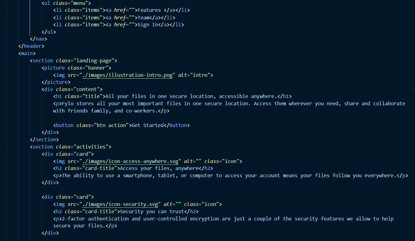
<main>
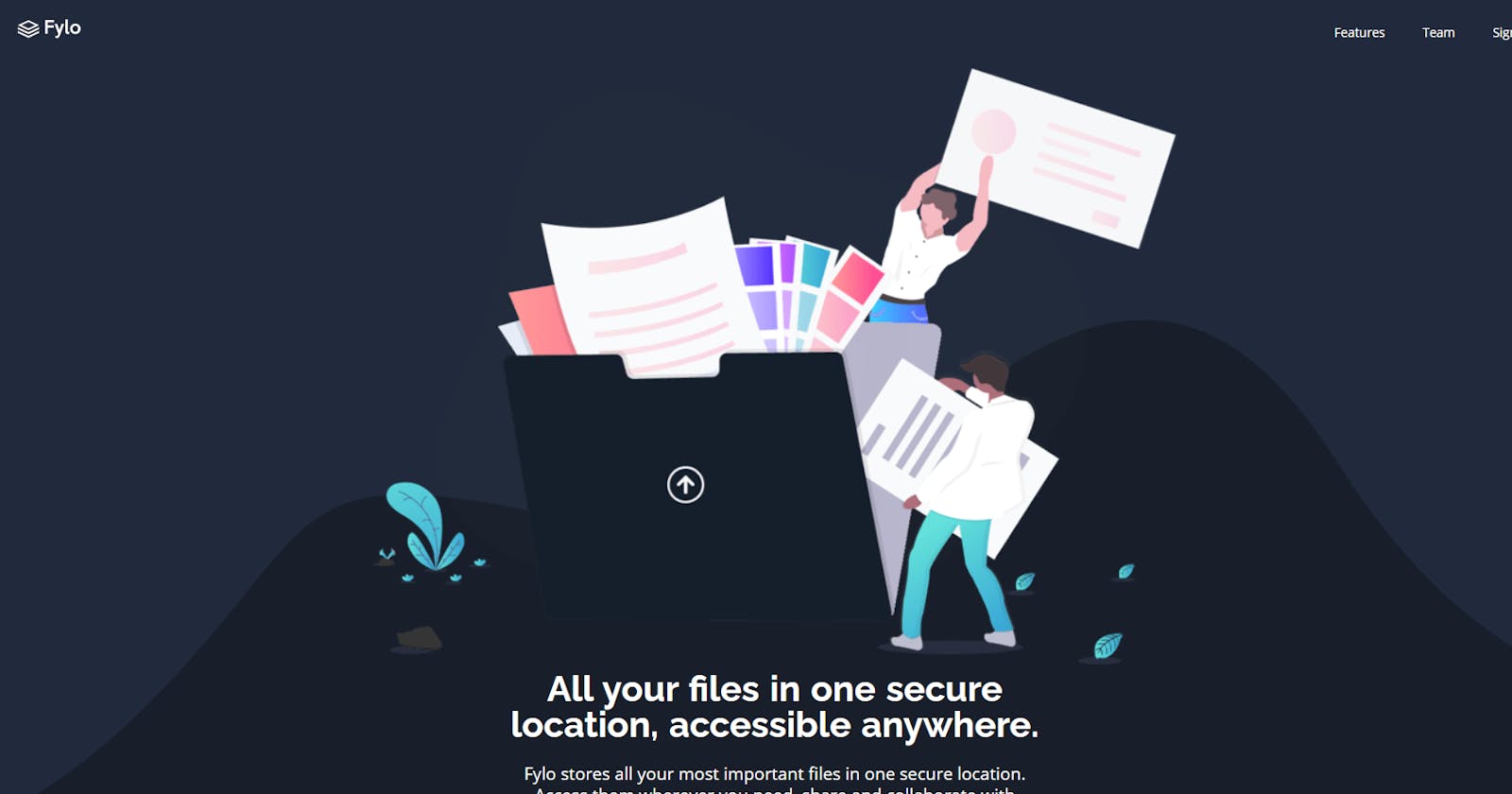
<section class="landing-page">
<picture class="banner">
<img src="./images/illustration-intro.png" alt="intro">
</picture>
<div class="content">
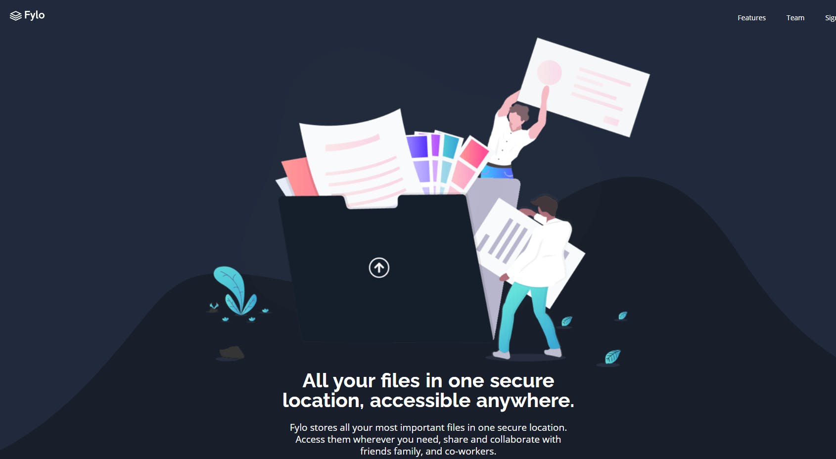
<h1 class="title">All your files in one secure location, accessible anywhere.</h1>
<p>Fylo stores all your most important files in one secure location. Access them wherever you need, share and collaborate with friends family, and co-workers.</p>
<button class="btn action">Get Started</button>
</div>
</section>
<section class="activities">
<div class="card">
<img src="./images/icon-access-anywhere.svg" alt="" class="icon">
<h2 class="card-title">Access your files, anywhere</h2>
<p>The ability to use a smartphone, tablet, or computer to access your account means your files follow you everywhere.</p>
</div>
<div class="card">
<img src="./images/icon-security.svg" alt="" class="icon">
<h2 class="card-title">Security you can trust</h2>
<p>2-factor authentication and user-controlled encryption are just a couple of the security features we allow to help secure your files.</p>
</div>
<div class="card">
<img src="./images/icon-collaboration.svg" alt="" class="icon">
<h2 class="card-title">Real-time collaboration</h2>
<p>Securely share files and folders with friends, family and colleagues for live collaboration. No email attachments required.</p>
</div>
<div class="card">
<img src="./images/icon-any-file.svg" alt="" class="icon">
<h2 class="card-title">Store any type of file</h2>
<p>Whether you're sharing holidays photos or work documents, Fylo has you covered allowing for all file types to be securely stored and shared.</p>
</div>
</section>
<section class="productive">
<picture class="banner">
<img src="./images/illustration-stay-productive.png" alt="be productive">
</picture>
<div class="content">
<h2 class="title">Stay productive, wherever you are</h2>
<p>Never let location be an issue when accessing your files. Fylo has you covered for all of your file storage needs. <br> Securely share files and folders with friends, family and colleagues for live collaboration. No email attachments required.</p>
<p><a href="">See how Fylo works<span><img src="./images/icon-arrow.svg" alt=""></span></a></p>
</div>
</section>
<div class="testimonials">
<div class="testimonial">
<p>Fylo has improved our team productivity by an order of magnitude. Since making the switch our team has become a well-oiled collaboration machine.</p>
<div class="profile">
<picture class="profile-image">
<img src="./images/profile-1.jpg" alt="">
</picture>
<div class="description">
<h3 class="name">Satish Patel </h3>
<p class="job">Founder & CEO, Huddle</p>
</div>
</div>
</div>
<div class="testimonial">
<p>Fylo has improved our team productivity by an order of magnitude. Since making the switch our team has become a well-oiled collaboration machine.</p>
<div class="profile">
<picture class="profile-image">
<img src="./images/profile-2.jpg" alt="">
</picture>
<div class="discription">
<h3 class="name">Bruce McKenzie</h3>
<p class="job">Founder & CEO, Huddle</p>
</div>
</div>
</div>
<div class="testimonial">
<p>Fylo has improved our team productivity by an order of magnitude. Since making the switch our team has become a well-oiled collaboration machine.</p>
<div class="profile">
<picture class="profile-image">
<img src="./images/profile-1.jpg" alt="">
</picture>
<div class="discription">
<h3 class="name">Iva Boyd </h3>
<p class="job">Founder & CEO, Huddle</p>
</div>
</div>
</div>
</div>
</main>
<footer>
<section class="footer">
<div class="subscription">
<h3>Get early access today</h3>
<p>It only takes a minute to sign up and our free starter tier is extremely generous. If you have any questions, our support team would be happy to help you.</p>
<form action="">
<input type="text">
<button class="btn submit">Get Started For Free</button>
</form>
</div>
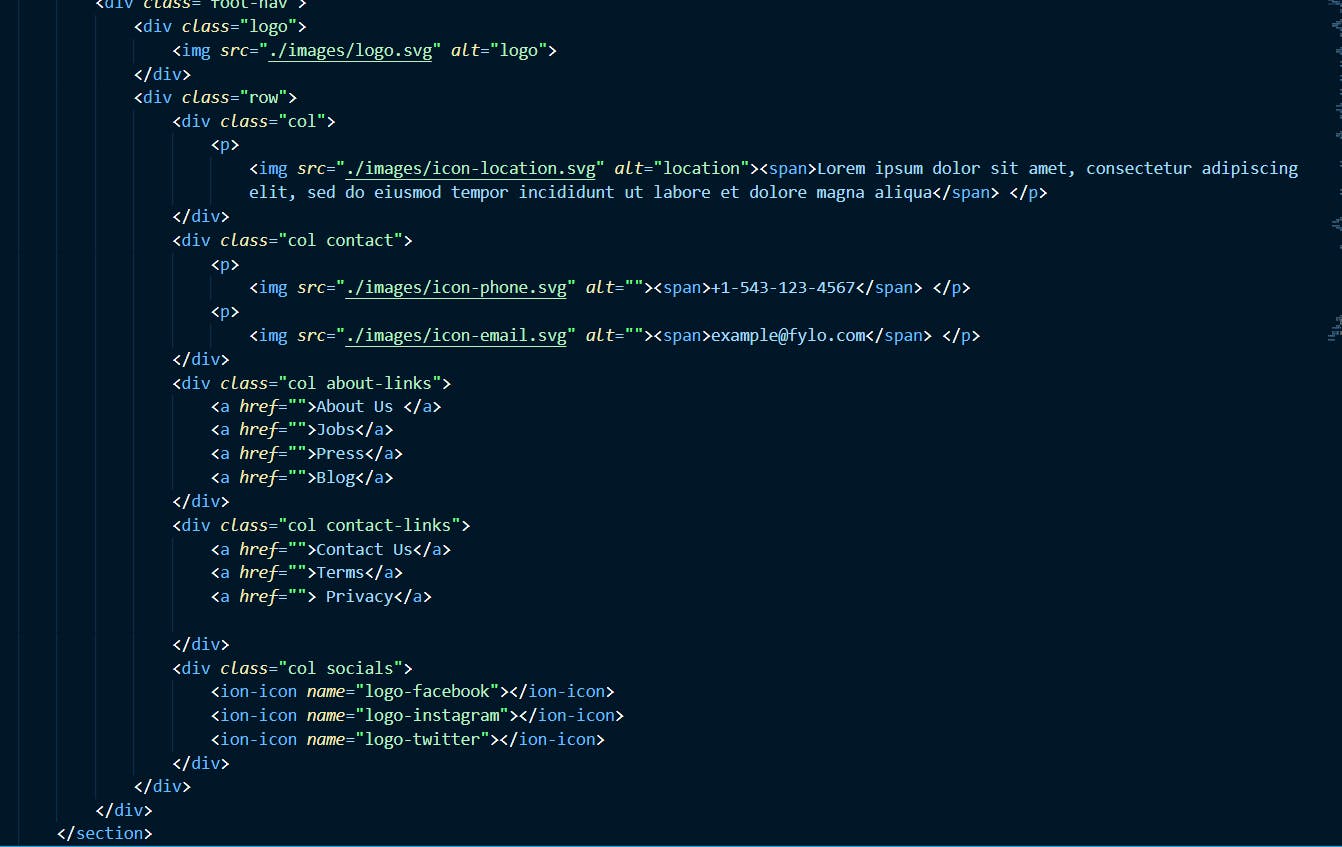
<div class="foot-nav">
<div class="logo">
<img src="./images/logo.svg" alt="logo">
</div>
<div class="row">
<div class="col">
<p>
<img src="./images/icon-location.svg" alt="location"><span>Lorem ipsum dolor sit amet, consectetur adipiscing elit, sed do eiusmod tempor incididunt ut labore et dolore magna aliqua</span> </p>
</div>
<div class="col contact">
<p>
<img src="./images/icon-phone.svg" alt=""><span>+1-543-123-4567</span> </p>
<p>
<img src="./images/icon-email.svg" alt=""><span>example@fylo.com</span> </p>
</div>
<div class="col about-links">
<a href="">About Us </a>
<a href="">Jobs</a>
<a href="">Press</a>
<a href="">Blog</a>
</div>
<div class="col contact-links">
<a href="">Contact Us</a>
<a href="">Terms</a>
<a href=""> Privacy</a>
</div>
<div class="col socials">
<ion-icon name="logo-facebook"></ion-icon>
<ion-icon name="logo-instagram"></ion-icon>
<ion-icon name="logo-twitter"></ion-icon>
</div>
</div>
</div>
</section>
<p class="attribution">
Challenge by <a href="https://www.frontendmentor.io?ref=challenge" target="_blank">Frontend Mentor</a>. Coded by <a href="#">Anachebe Ikechukwu</a>.
</p>
</footer>
<script type="module" src="https://unpkg.com/ionicons@5.5.2/dist/ionicons/ionicons.esm.js"></script>
<script nomodule src="https://unpkg.com/ionicons@5.5.2/dist/ionicons/ionicons.js"></script>
</body>
</html>
Step 2: Write the CSS for the main components
I usually start my CSS with wildcards * , so I started off with:
*,
*::before,
*::after {
    margin: 0;
    padding: 0;
    box-sizing: border-box;
}
next, I defined the roots, these are styles I want to apply repeatedly in different sections, these include; font-size, background, color, fonts.
:root {
    --mainBg: hsl(218, 28%, 13%);
    --footerBg: hsl(216, 53%, 9%);
    --testimonialBg: hsl(219, 30%, 18%);
    --btnBg: hsl(176, 68%, 64%);
    --btnBgInside: hsl(198, 60%, 50%);
    --error: hsl(0, 100%, 63%);
    --white: hsl(0, 0%, 100%);
    --fontBody: 14px;
    --bodyFont: 'Open Sans', sans-serif;
    --headingFont: 'Raleway', sans-serif;
}
next, I added styles to major components like body, hyperlinks, paragraphs, headings, e.t.c.
body {
    width: 100%;
    /* background-color: green; */
    background: var(--testimonialBg);
    color: var(--white);
    position: relative;
    font-size: var(--fontBody);
    font-family: var(--bodyFont);
    font-weight: 400;
    line-height: 1.8em;
    z-index: 0;
}

header {
    width: 100%;
    padding: .8em;
}

a {
    color: var(--white);
    text-decoration: none;
}

main {
    width: 100%;
}

section {
    width: 100%;
}

h1,
h2,
h3,
h4,
h5,
h6 {
    color: var(--white);
    font-family: var(--headingFont);
}
Step 3: Add Styles to the landing page section.
.landing-page {
    position: relative;
    display: flex;
    flex-direction: column;
    width: 100%;
    padding-left: 2em;
    padding-right: 2em;
    height: 100vh;
    align-items: center;
    justify-content: center;
    text-align: center;
}

.landing-page::after {
    content: "";
    width: 100%;
    position: absolute;
    top: 50vh;
    left: 0;
    right: 0;
    bottom: 0;
    background-image: url(./images/bg-curvy-mobile.svg);
    background-position: center;
    background-repeat: no-repeat;
    background-size: cover;
    z-index: -1;
}

.banner {
    width: 90%;
    max-width: 900px;
    margin: auto;
}

.banner img {
    width: 100%;
}

.content {
    width: 100%;
    max-width: 70ch;
    margin-bottom: 4em;
}

.title {
    font-weight: 700;
    font-size: 1.5rem;
    word-spacing: 2px;
}

.content p {
    margin-top: 1.2em;
    margin-bottom: 1.2em;
}

.btn {
    border: none;
    outline: none;
    background: linear-gradient(45deg, var(--btnBg), var(--btnBgInside));
    color: var(--white);
    cursor: pointer;
    border-radius: 50px;
    -webkit-border-radius: 50px;
    -moz-border-radius: 50px;
    -ms-border-radius: 50px;
    -o-border-radius: 50px;
}

.action {
    padding: .8em 4em;
}
The major challenge here was adding the svg curvy background on the landing page. After several struggles, I ended using the pseudo-class "::after" on the "landing-page" class.
Step 4: Building Other sections.
After creating the styles for the landing page, I got the flow and was able to build the other components easier as most of my classes are reusable. Here is the CSS code for the rest of the page.
.activities,
.productive,
.testimonials {
    background: var(--mainBg);
    width: 100%;
}

.activities {
    padding: 4em 2em;
    text-align: center;
}

.card {
    margin-top: 4em;
    margin-bottom: 4em;
}

.icon,
.card-title {
    margin-bottom: .5em;
}

.productive {
    padding: 2em;
    text-align: left;
}

.productive .title {
    font-size: 1.2rem;
}

.productive a {
    text-decoration: none;
    color: var(--btnBg);
    padding-bottom: 2px;
    border-bottom: 1px solid var(--btnBg);
}

.productive a span {
    margin-left: 4px;
}

.testimonials {
    display: flex;
    flex-direction: column;
    align-items: center;
    gap: 2em;
    padding: 5em 3em;
    padding-bottom: 20em;
}

.testimonial {
    background: var(--testimonialBg);
    padding: 1em;
}

.testimonial p {
    font-size: 12px;
    line-height: 1.5em;
}

.profile {
    display: flex;
    align-items: center;
    height: 35px;
    gap: 10px;
    margin-top: 1.2em;
}

.profile-image {
    width: 30px;
    height: 30px;
    border-radius: 50%;
    -webkit-border-radius: 50%;
    -moz-border-radius: 50%;
    -ms-border-radius: 50%;
    -o-border-radius: 50%;
}

.profile-image img {
    width: 100%;
    border-radius: 50%;
    -webkit-border-radius: 50%;
    -moz-border-radius: 50%;
    -ms-border-radius: 50%;
    -o-border-radius: 50%;
}

.name,
p.job {
    font-size: .6rem;
}

footer {
    width: 100%;
    position: relative;
    background: var(--footerBg);
}

.subscription {
    position: absolute;
    top: -20%;
    left: 50%;
    right: 0;
    width: 85%;
    max-width: 700px;
    text-align: center;
    padding: 2em 1.5em;
    background: var(--testimonialBg);
    transform: translateX(-50%);
    -webkit-transform: translateX(-50%);
    -moz-transform: translateX(-50%);
    -ms-transform: translateX(-50%);
    -o-transform: translateX(-50%);
    box-shadow: 0 2.1px 2.5px rgba(0, 0, 0, 0.019), 0 5.9px 6.8px rgba(0, 0, 0, 0.032), 0 14.2px 15.3px rgba(0, 0, 0, 0.05), 0 47px 50px rgba(0, 0, 0, 0.11);
    border-radius: 7px;
    -webkit-border-radius: 7px;
    -moz-border-radius: 7px;
    -ms-border-radius: 7px;
    -o-border-radius: 7px;
}

.subscription h3,
.subscription p {
    margin-bottom: .5em;
    line-height: 1.5em;
}

form {
    margin-top: 1.5em;
    display: flex;
    flex-direction: column;
    align-items: stretch;
    gap: 1.2em;
}

input {
    border: none;
    outline: none;
    height: 40px;
    border-radius: 50px;
    -webkit-border-radius: 50px;
    -moz-border-radius: 50px;
    -ms-border-radius: 50px;
    -o-border-radius: 50px;
}

.submit {
    height: 40px;
    font-size: 10px;
}

.footer {
    position: relative;
    padding-left: 2em;
    padding-right: 2em;
}

.foot-nav {
    padding-top: 15em;
}

.foot-nav .logo {
    width: 100px;
    margin-bottom: 1em;
}

.col p {
    display: flex;
    align-items: flex-start;
    gap: 1em;
    margin-top: 1em;
}

.col a {
    display: block;
    text-decoration: none;
    color: var(--white);
}

.about-links,
.contact-links {
    margin-top: 2.5em;
}

.socials {
    display: flex;
    align-items: center;
    justify-content: center;
    gap: 2em;
    margin-top: 2em;
    margin-bottom: 2em;
}

ion-icon {
    transform: scale(2);
    -webkit-transform: scale(2);
    -moz-transform: scale(2);
    -ms-transform: scale(2);
    -o-transform: scale(2);
}

ion-icon:hover {
    color: var(--btnBg);
    cursor: pointer;
}
One major challenge here was styling the "subscription" class on the footer. I used "position: absolute;" in the class after setting the parent footer to "position: relative;". Then I used "top: 20%" to move the subscription class off the footer.
Step 5: Adding Media Querries for Desktop breakpoints.
With media queries, it is easier to set different layout for different screen sizes. And with the help of flexbox and grid, this is very easy to achieve. I only used flexbox in this challenge though, since the layout isn't very difficult, most of the principle I used is "column" for mobile, "row" for desktop and "flex-wrap: wrap" on most components.
@media screen and (min-width:769px) {
    header {
        padding: 1em 4em;
    }
    .menu {
        gap: 3em;
    }
    .landing-page {
        height: 100vh;
        justify-content: flex-start;
        margin-top: 0;
    }
    .banner {
        height: 700px;
    }
    .landing-page::after {
        top: 30vh;
        background-image: url(./images/bg-curvy-desktop.svg);
    }
    .content {
        width: 100%;
        max-width: 75ch;
        margin-bottom: 4em;
    }
    .title {
        font-weight: 700;
        font-size: 2.5rem;
        line-height: 1em;
        word-spacing: 2px;
    }
    .content p {
        line-height: 1.3em;
        font-size: 1.2rem;
    }
    .btn {
        border: none;
        outline: none;
        background: linear-gradient(45deg, var(--btnBg), var(--btnBgInside));
        color: var(--white);
        cursor: pointer;
        border-radius: 50px;
        -webkit-border-radius: 50px;
        -moz-border-radius: 50px;
        -ms-border-radius: 50px;
        -o-border-radius: 50px;
    }
    .action {
        padding: 1em 5em;
        font-size: 1rem;
    }
    .activities {
        display: flex;
        flex-wrap: wrap;
        justify-content: space-around;
        align-items: center;
        gap: 5em;
        padding-left: 10em;
        padding-right: 10em;
        padding-top: 15em;
    }
    .card {
        max-width: 40em;
    }
    .productive {
        display: flex;
        align-items: center;
        padding-right: 4em;
        padding-left: 4em;
    }
    .productive .banner {
        width: 50%;
    }
    .productive .content {
        width: 50%;
    }
    .productive .title {
        font-size: 2.2rem;
    }
    .testimonials {
        flex-direction: row;
        justify-content: center;
        gap: 3em;
    }
    .testimonial {
        padding: 2em;
        max-width: 400px;
    }
    .footer {
        padding-left: 6em;
        padding-right: 6em;
    }
    .subscription h3 {
        font-size: 1.5rem;
    }
    form {
        width: 90%;
        margin-left: auto;
        margin-right: auto;
        flex-direction: row;
        justify-content: space-between;
        gap: 1.5em;
    }
    input {
        width: 70%;
    }
    .submit {
        width: 30%;
        font-size: 1rem;
    }
    .row {
        display: flex;
        align-items: flex-start;
        gap: 2em;
        justify-content: space-between;
        flex-wrap: wrap;
        margin-bottom: 3em;
    }
    .col {
        max-width: 60ch;
        margin-top: 0;
    }
}
In the end, I was happy with my design, though I still have room for improvement. This is the link to the live site: dark-webpage-challenge.vercel.app